Table of Contents
Before a single keyword was researched or a line of content written, the site needed to function. The original Saved By Nature website had structural and design problems serious enough to undermine everything built on top of it. This page documents the audit findings, rebuild decisions, and UX improvements that formed the foundation for all subsequent SEO and conversion work.
| Area | Problem Identified | Solution Applied |
|---|---|---|
| Mobile navigation | Labels truncated mid-word | Menu rebuilt from scratch |
| Information architecture | Programs buried 3–4 clicks deep | IA restructured; programs accessible in 2 clicks |
| Mobile responsiveness | Content not built for mobile | All pages rebuilt and tested for mobile |
| Visual identity | No consistent brand palette | Colour palette applied across site and marketing |
| Page navigation | No way to jump between sections | Tables of Contents + Back-to-Top added site-wide |
The UX audit identified problems in three areas — all of which were creating friction before a visitor ever reached a program page or enrollment form.
The mobile hamburger menu cut off menu item labels mid-word:
Visitors couldn’t identify key pages at a glance. They were guessing at destinations rather than navigating with confidence.
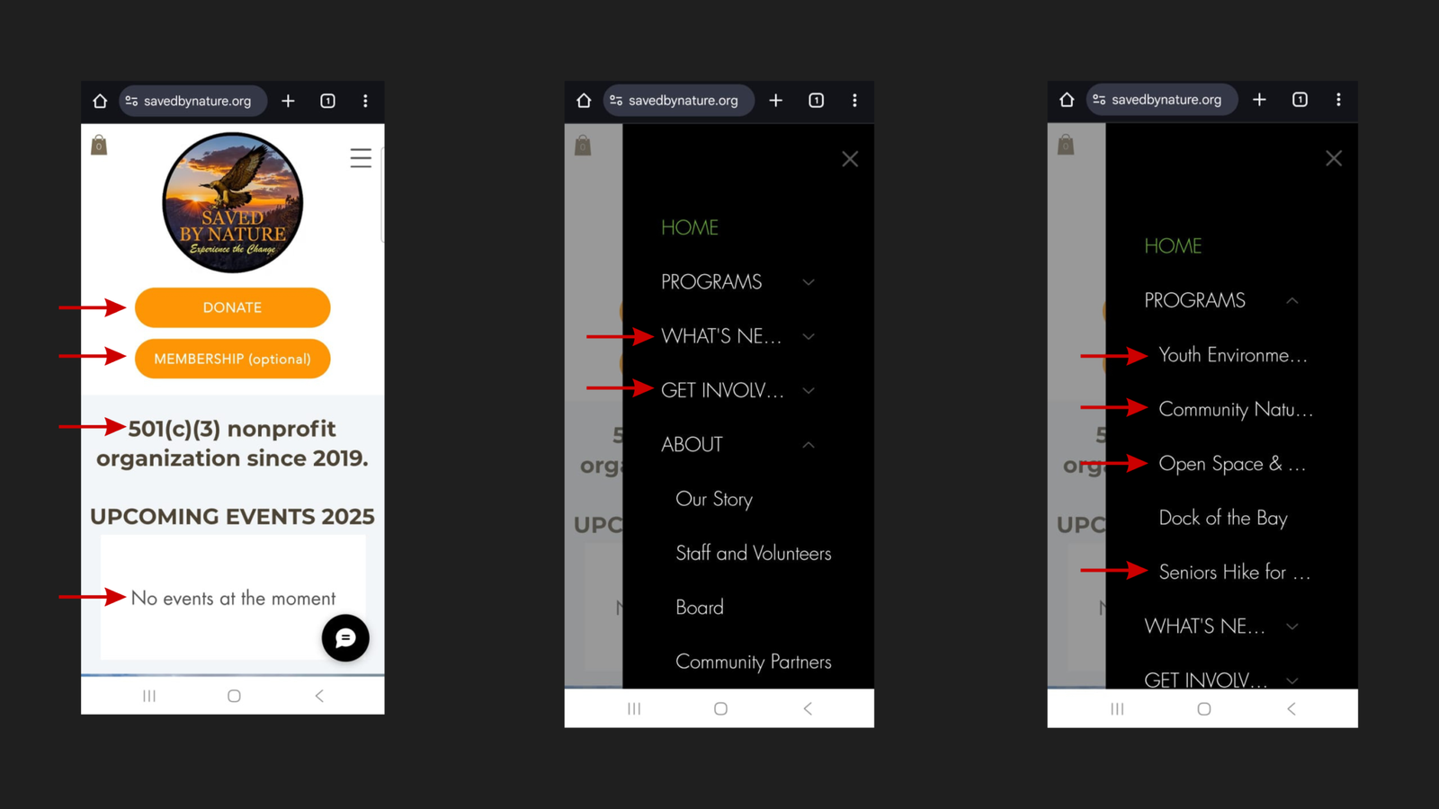
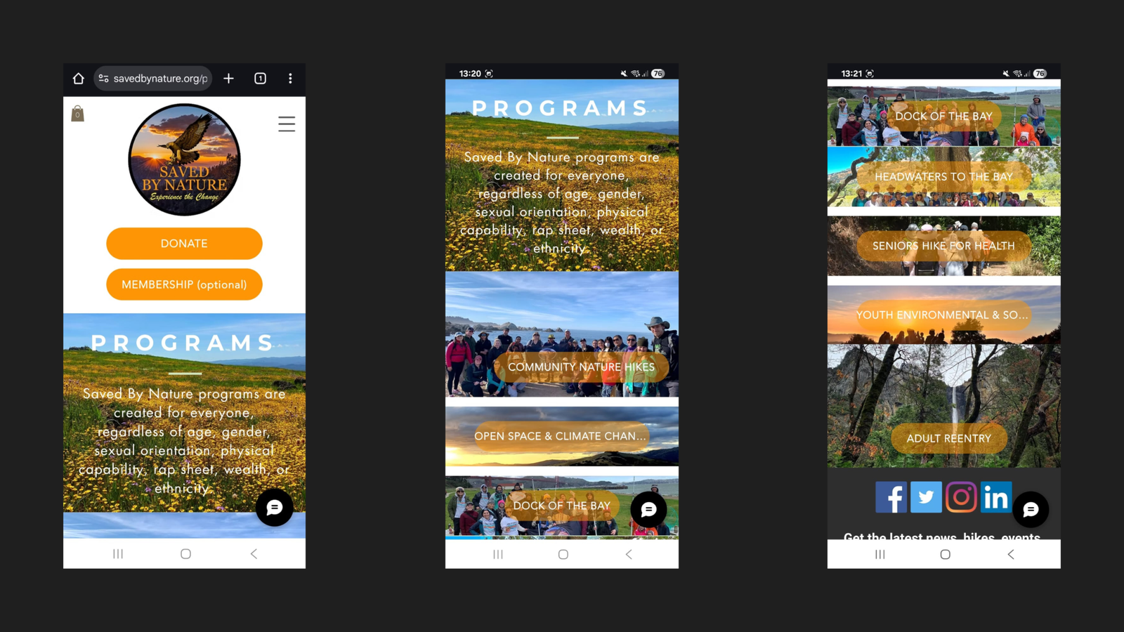
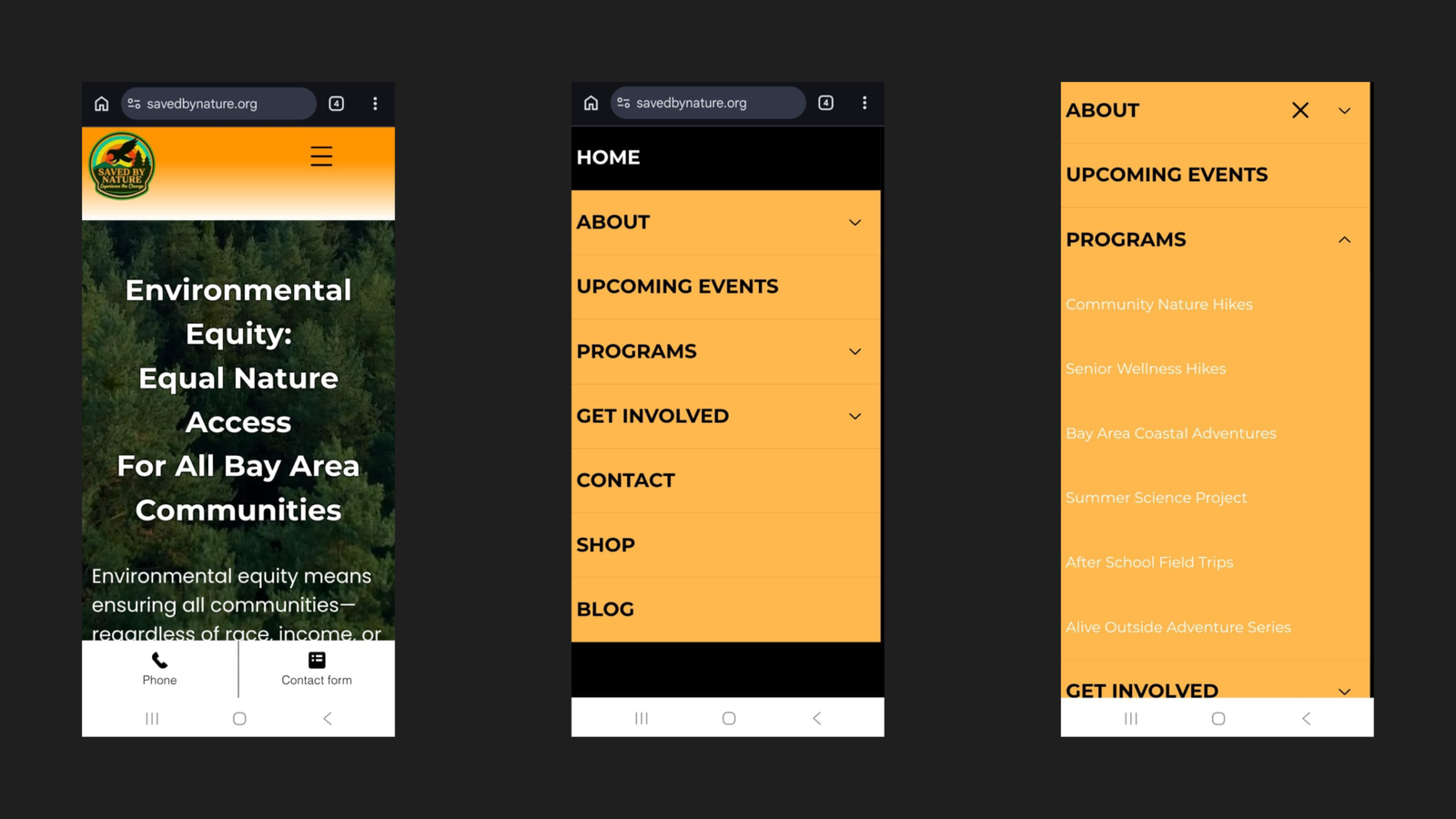
Program pages were accessible only three to four clicks deep on mobile. A parent or community member arriving on the homepage with no prior knowledge of SBN’s site structure had no logical shortcut to program information. On a site where program enrollment was the primary conversion goal, every unnecessary click was a potential exit.
Site content had not been built or tested for mobile display:
The decision was made to rebuild the entire site from the ground up rather than patch individual issues. A surface-level fix would have left the underlying structural problems intact — and any content or SEO work built on top of a broken foundation would be undermined by it.
The rebuild was guided by four objectives:
A consistent color palette was established and applied across the rebuilt website and all marketing materials — replacing the inconsistent visual presentation the original site had carried.
| Color | Hex Code | Usage |
|---|---|---|
| Deep Orange | #FF9500 | CTA buttons |
| Light Orange | #FFB84D | Applied throughout as needed |
| White | #FFFFFF | Applied throughout as needed |
| Black | #000000 | Applied throughout as needed |
Two navigation improvements were added to every main page of the rebuilt site.
A persistent Back-to-Top button was added throughout the site. On longer pages — such as program pages, and blog posts — this eliminates the need to scroll back to the top to reach the navigation. A small detail that meaningfully reduces effort on pages where users are actively reading.
Every main page now includes a Table of Contents with anchor links to each section. This serves two purposes simultaneously:
The homepage Table of Contents links to eight sections:
With the audit findings documented, the mobile experience was rebuilt end to end across three areas.
| Before | After |
|---|---|
| Labels truncated mid-word | Every label fully visible |
| Programs buried in multi-step path | Programs accessible directly via PROGRAMS submenu |
| Menu structure unclear | Logical, intuitive hierarchy throughout |
The IA was restructured so that key pages — particularly program information — are accessible in significantly fewer clicks. All six programs now appear as clearly labelled submenu items directly under PROGRAMS in the mobile menu:
All pages were built and tested across screen sizes: