Below-the-Fold Content Analysis
Everything below documents what a visitor would see if they scrolled. A visitor who saw no reason to scroll left having encountered none of it.
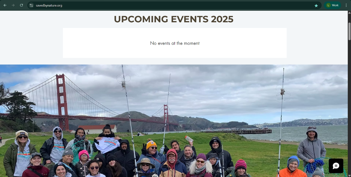
The Dock of the Bay Photo: Right Content, Wrong Position
Immediately below the fold, a full-width panoramic photo shows 20+ community participants at the Golden Gate waterfront — real people, a recognizable Bay Area location, genuine participation. It’s the most persuasive content on the page. It’s also positioned where most visitors never see it.
Mission and Vision: Buried
Impact Statistics: The Strongest Proof on the Page, Buried
These are the strongest trust signals on the entire homepage — specific, verifiable, and directly relevant to the communities SBN serves. A healthcare provider evaluating whether to refer senior patients would find “941 seniors guided” immediately compelling. Any visitor who left before scrolling never saw a single one of these numbers.
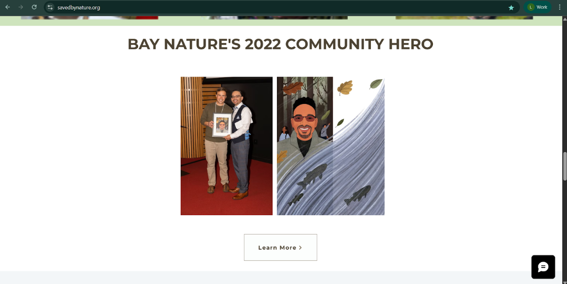
Bay Nature's 2022 Community Hero Award: Wasted Credibility
Third-party endorsements do their job when visible at the moment a visitor is deciding whether to trust an organization. Placed at the bottom of a page most visitors never reach, this award did no conversion work at all.
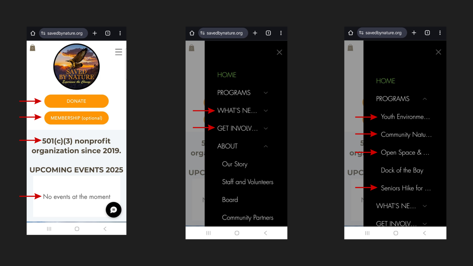
No Program Content in the Homepage Body
A complete scroll of the homepage reveals no program names, descriptions, or program-level CTAs anywhere in the body. Programs exist only inside a hover-dependent navigation dropdown — an interaction most mobile users, and many desktop users, never initiate. For a nonprofit whose core value proposition is its six community programs, this is a fundamental structural failure.
Our Values: Good Content, No Pathway
The “Our Values” section presents three image tiles — Environmental Education, Community, Outdoors For All — with authentic photography, but captions are partially obscured by the tile overlay and no CTA links to a relevant program page. Values content without a conversion pathway leaves visitors informed but unable to act.
Grantors and Sponsors: An Empty Section
Grant-funded nonprofits typically treat funder acknowledgment as both a relationship obligation and a trust signal. Displaying it as an empty placeholder achieves the opposite effect.