SBN Website Optimization:
Homepage & UX Audit
Table of Contents
Overview
Saved By Nature’s homepage suffers from a fundamental structural failure: its most persuasive content is completely invisible to the majority of visitors who land on it.
The above-the-fold experience — the only portion of the page most visitors ever see — contains no mission content, no program information, and no reason to stay. The first thing a visitor sees is a request for money. The second is a notification that the organisation has no upcoming events. The third is a legal classification. By the time SBN’s genuine impact — award recognition, community photos, and concrete participation statistics — appears on the page, a visitor who arrived looking for a program to join has been given no reason to scroll.
The organization has a compelling mission, verified impact, and authentic community photography. None of it is working because the information hierarchy is inverted.
Audit Summary
| Issue Category | Severity | Impact |
|---|---|---|
| Above-fold content hierarchy | 🔴 Critical | Financial ask before demonstrated value |
| No events" messaging | 🔴 Critical | Communicates inactivity, triggers exit intent |
| Impact content buried | 🔴 Critical | Trust signals invisible to bouncing visitors |
| Navigation architecture | 🔴 Critical | No participation pathway in GET INVOLVED |
| Mobile experience | 🔴 Critical | Truncated names, multi-tap journey, no enrollment |
| Program content absent from homepage body | 🔴 Critical | No program discovery without navigating |
| Newsletter friction | 🟡 Moderate | Four required fields reduces sign-up conversion |
| Empty grantors section | 🟡 Moderate | Broken visual undermines credibility |
Above-the-Fold Analysis
The above-the-fold experience is the entirety of what a first-time visitor sees before scrolling. For a visitor who arrives with program-seeking intent and finds no relevant content, it is also the only part of the page they see.
Visual Hierarchy — What Visitors See First
The above-the-fold section contains six visible elements, in the order a visitor’s eye encounters them:
| Position | Element | Assessment |
|---|---|---|
| 1 | SBN Logo (circular eagle, top left) | ✅ Brand recognition, appropriate placement |
| 2 | DONATE button (orange, top right) | ❌ Financial ask before any demonstrated value |
| 3 | MEMBERSHIP (optional) button (orange, below DONATE) | ❌ "Optional" language devalues membership |
| 4 | "501(c)(3) nonprofit organization since 2019." | ❌ Legal classification over mission impact |
| 5 | "UPCOMING EVENTS 2025" heading | 🟡 Good intent, poor execution |
| 6 | "No events at the moment" | 🔴 Actively discourages engagement |
The navigation bar — HOME, PROGRAMS, WHAT’S NEW?, GET INVOLVED, ABOUT — is present but entirely text-based. No visual cues, imagery, or mission content appear above the fold.
The "No Events" Conversion Killer
The most prominent piece of content on the homepage is a negative message. “No events at the moment” occupies the largest content block visible above the fold, placed inside a dedicated white panel with clear visual framing that draws the eye directly to it.
Why this is a critical failure:
- A visitor arriving from a search for “youth programs bay area” or “senior hiking groups San Jose” immediately receives confirmation that the organisation is inactive.
- The heading “UPCOMING EVENTS 2025” sets an expectation, then immediately fails to meet it — a two-step disappointment sequence.
- The message communicates the same outcome to a potential program participant as to a potential donor: there is nothing happening here.
- Six active programs with real schedules existed at the time of this audit. The “No events” message was a calendar configuration failure, not an organisational reality — but visitors had no way to know that.
The exit intent trigger: When users arrive with program-seeking intent and encounter evidence of inactivity within two seconds, they leave before reaching any content that would change their perception. A homepage that leads with inactivity messaging rather than program value is structurally optimised for exits, not engagement.
CTA Hierarchy — Financial Commitment Before Demonstrated Value
The two interactive CTAs visible above the fold are both financial:
DONATE — The most visually prominent element on the page outside the logo. Orange button, upper right, above the navigation bar. This is the first action the site invites visitors to take.
MEMBERSHIP (optional) — Positioned directly below DONATE, same orange styling but labelled “optional.” The word “optional” in parentheses signals that participation itself is non-essential — an unintended but damaging message for an organization trying to grow community involvement.
There are no program discovery CTAs, no “Join a program” buttons, and no “Learn more” links visible above the fold. A visitor who wants to participate has no visible pathway to do so from the first screen.
Conversion principle violated: Visitors must perceive value before they will commit resources — whether that resource is money, time, or personal information. Placing financial asks before mission content inverts this sequence and systematically reduces conversion across every visitor segment.
Navigation Architecture
Desktop Navigation — Structure and Accessibility
The desktop navigation bar contains five top-level items: HOME, PROGRAMS, WHAT’S NEW?, GET INVOLVED, ABOUT.
Programs dropdown — confirmed items from screenshot:
- Youth Environmental & Social Justice
- Community Nature Hikes
- Open Space & Climate Change
- Dock of the Bay
- Seniors Hike for Health
Five programs are visible in the navigation dropdown. The sixth program (Adult Reentry) was in development at the time of this audit and was accessible via direct URL but not listed in the main navigation.
Structural issues:
- No enrollment pathways — Every program page linked from this dropdown leads to program information only; no sign-up or enrollment mechanism exists at any destination.
- No Contact page — The navigation contains no contact option anywhere across all five top-level items and their dropdowns. Healthcare providers, social workers, and justice system professionals seeking to refer clients to SBN’s programs have no pathway to make contact.
The GET INVOLVED Dropdown — Zero Participation Pathways
The GET INVOLVED dropdown contains six items:
- Donate
- Membership
- Volunteer
- Corporate Matching
- Donor-Advised Funds
- Sponsor
Five of the six options are financial asks: donating money, purchasing membership, corporate matching, donor-advised fund contributions, and sponsorship. The sixth — Volunteer — is a contribution of time rather than money, but it still asks visitors to give something to SBN rather than offering them something in return.
None of the six options serve a community member looking to join a program as a participant. There is no “Join a Program,” “Sign Up,” “Participate,” or “Find a Hike” option anywhere in this dropdown. For the primary audience SBN’s organic search traffic represents — seniors looking for hiking groups, families seeking nature programs, youth seeking outdoor activities — this dropdown offers nothing relevant. The label “GET INVOLVED” implies participation; the content delivers only asks for financial or volunteer contributions.
Mobile Navigation — Truncation and a Dead-End Journey
Mobile visitors encountered a fundamentally degraded navigation experience.
The Multi-Tap Journey to Program Information
- Land on homepage → See “No events” and donation requests.
- Tap hamburger menu → Access condensed navigation.
- Tap “PROGRAMS” → View dropdown with truncated program names.
- Encounter cut-off text → “Youth Environme…” instead of “Youth Environmental & Social Justice”.
- Tap specific program → Finally reach program page.
- Find no enrollment options → Exit in frustration.
Mobile-Specific Failures
- Navigation label truncation — “GET INVOLVED” appears as “GET INVOLV…” in the mobile menu. Program names are cut mid-word throughout the Programs dropdown. Visitors cannot identify which program they are selecting without prior knowledge of the full names.
- Three navigation taps minimum before reaching any program content — hamburger open, Programs tap, individual program tap.
- DONATE button dominates mobile screen space — The orange DONATE button occupies a disproportionate area of the limited mobile viewport, pushing all other content further down.
- No enrollment options at destination — After completing the multi-tap journey, mobile users arrive at program pages with no sign-up mechanism.
Below-the-Fold Content Analysis
What follows documents everything visible on the homepage below the initial viewport. A visitor who arrives, sees no reason to scroll, and leaves has encountered none of it.
The Dock of the Bay Community Photo — Wrong Position, Right Content
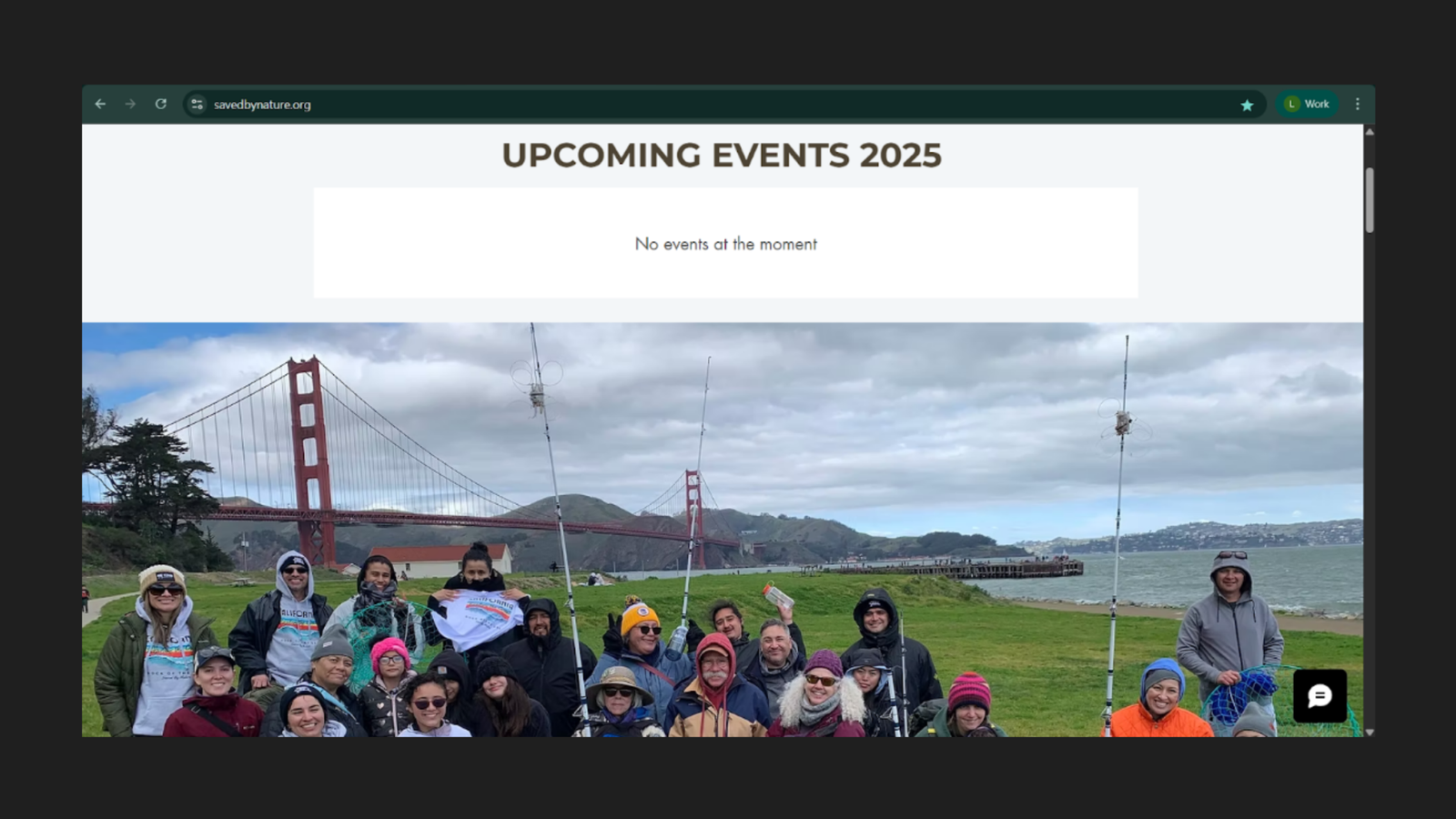
Immediately below the above-the-fold section, the homepage displays a full-width panoramic photo of 20+ community participants gathered at the Golden Gate waterfront with fishing rods — an authentic, compelling image from the Dock of the Bay program.
This photograph is the most persuasive piece of content on the entire homepage. It shows real people, a recognisable Bay Area location, and genuine community participation. It is positioned where the majority of visitors never see it.
The visual hierarchy is inverted: the negative “No events” message appears first, and the evidence of active community programming appears after visitors have already left.
Mission and Vision — Buried Beneath the Fold
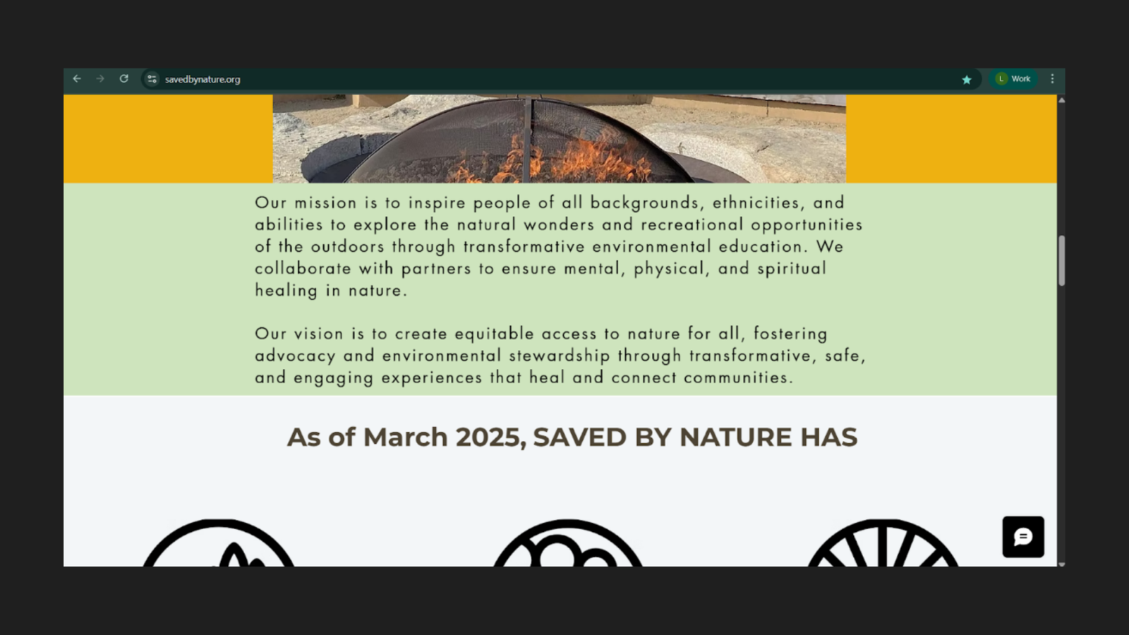
Below the community photo, the homepage presents SBN’s full mission and vision statements:
Mission: To inspire people of all backgrounds, ethnicities, and abilities to explore the natural wonders and recreational opportunities of the outdoors through transformative environmental education — collaborating with partners to ensure mental, physical, and spiritual healing in nature.
Vision: To create equitable access to nature for all, fostering advocacy and environmental stewardship through transformative, safe, and engaging experiences that heal and connect communities.
Both statements are well-crafted and directly relevant to SBN’s target audience. A senior looking for inclusive outdoor programming, a parent seeking nature education for their child, or a social worker identifying community resources would find this content highly relevant. None of them are seeing it.
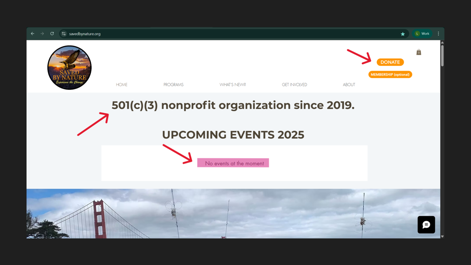
Impact Statistics — Powerful Proof Buried Below the Fold
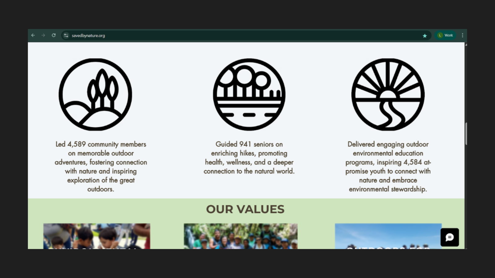
Under the heading “As of March 2025, SAVED BY NATURE HAS,” the homepage displays three concrete impact figures:
| Metric | Figure |
|---|---|
| Community members led on outdoor adventures | 4,589 |
| Seniors guided on enriching hikes | 941 |
| At-promise youth inspired through environmental education | 4,584 |
These are the strongest trust signals on the entire homepage. They are specific, verifiable, and directly relevant to the communities SBN serves. A healthcare provider considering whether to refer senior patients to SBN’s hiking program would find “941 seniors guided” immediately compelling. A school administrator evaluating youth programming would respond to “4,584 at-promise youth inspired.”
Any visitor who arrives on the homepage, encounters no reason to scroll, and leaves has never seen these numbers. They are functionally invisible to the audience most likely to act on them.
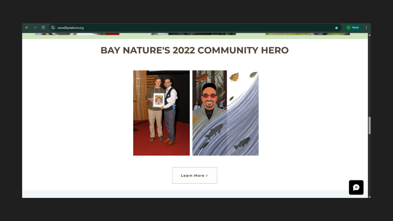
Bay Nature's 2022 Community Hero Award — Third-Party Credibility Wasted
The homepage features a dedicated section recognising SBN as Bay Nature’s 2022 Community Hero, accompanied by a professional award ceremony photograph. This is a third-party credibility endorsement from a respected regional environmental publication — exactly the kind of social proof that builds trust with first-time visitors.
It is positioned near the bottom of the page, below the impact statistics, below the values section, and well below the point at which the majority of visitors have already left.
Why this placement is a missed opportunity: Third-party endorsements serve their purpose when they are visible at the moment of decision — when a visitor is evaluating whether to trust an organization. Placed at the bottom of a page most visitors never reach, the award does no conversion work at all.
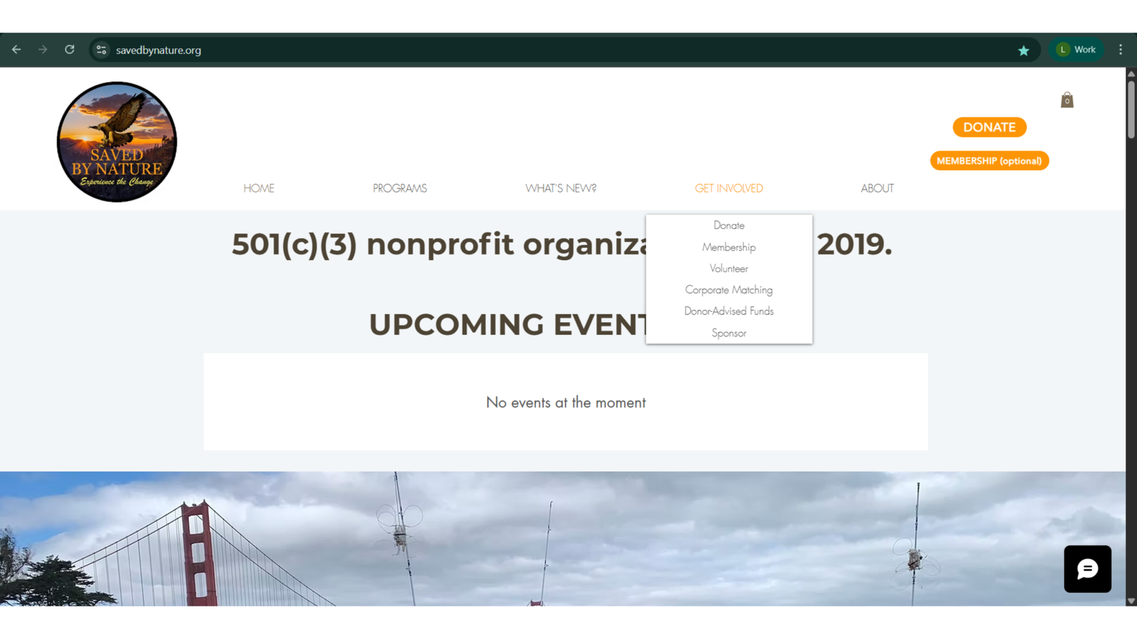
No Program Content in the Homepage Body
A complete scroll of the homepage body reveals no program names, program descriptions, or program-level CTAs anywhere in the page content. Programs are accessible only through the navigation dropdown — a hover-dependent, multi-step interaction that most mobile users and many desktop users will not initiate.
For a nonprofit whose core value proposition is its six community programs, the absence of any program content in the homepage body is a fundamental structural failure. A visitor who cannot navigate dropdowns — or who has not thought to look for a Programs menu item — will leave the homepage with no understanding of what SBN actually offers.
The "Our Values" Section — Good Content, Poor Execution
The homepage includes an “OUR VALUES” section with three image tiles: Environmental Education, Community, and Outdoors For All. The section demonstrates SBN’s programmatic values with authentic photography. However, the image captions are partially obscured by the tile overlay design, and the section contains no CTAs linking to relevant program pages. Values content without a conversion pathway leaves visitors informed but unable to act.
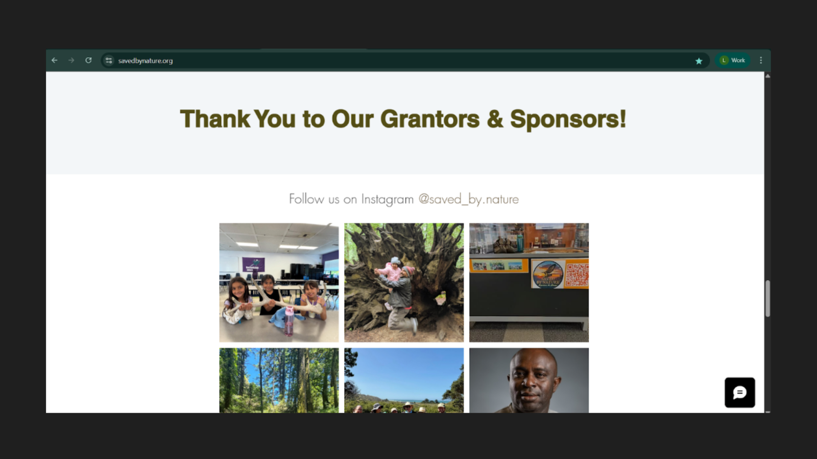
Grantors and Sponsors — Empty Section
A section headed “Thank You to Our Grantors & Sponsors!” appears on the homepage with no visible content below it — no logos, no organisation names, no acknowledgements of any kind.
Why this matters: An empty section with a heading creates one of two impressions: the organisation has no funders to acknowledge, or the website is broken. Neither impression is accurate, but both undermine credibility. Grant-funded nonprofits typically treat funder acknowledgement as both a relationship obligation and a trust signal. Displaying it as an empty placeholder achieves the opposite effect.
Footer — Newsletter Sign-Up Friction
The footer contains a newsletter subscription form with the copy “Get the latest news, hikes, events, and more right to your inbox.” The form requires four fields before submission:
- First Name (required)
- Last Name (required)
- Email address (required)
- Zip Code (required)
The friction problem: Newsletter sign-up is a low-commitment action — a visitor expressing mild interest and willingness to hear more. Requiring four fields including zip code introduces unnecessary friction at precisely the moment a visitor is considering the smallest possible first step toward engagement.
Industry standard for newsletter subscription is first name and email only. Each additional required field reduces completion rate. Requiring last name and zip code for a community nonprofit’s newsletter is not justified by any audience segmentation benefit that outweighs the conversion cost.
The footer also displays four social media icons: Facebook, Twitter, Instagram, and LinkedIn. These are present and functional but represent outbound links — directing visitors away from the site at the point of lowest engagement.
Summary of Critical Failures
The homepage’s issues are not isolated design problems — they form a system of compounding failures that ensure high-intent visitors leave without converting.
The Compounding Failure Sequence
- Visitor arrives with program-seeking intent.
- Sees a financial ask (DONATE) before any demonstration of value.
- Sees confirmation of inactivity (“No events at the moment”).
- Sees a legal classification instead of a mission statement.
- Has no visible CTA to find programs.
- Leaves — without ever reaching the community photos, impact statistics, mission content, or award recognition that would have changed their decision.
Each element reinforces the others. The “No events” message is damaging on its own; placed alongside DONATE as the dominant above-fold content, it creates an environment where the only perceived action available is giving money to an apparently inactive organization.
Content That Exists But Isn't Working
| Asset | Current Position | Where It Should Be |
|---|---|---|
| Community group photo (20+ participants) | Below fold, decorative background | Hero section, above fold |
| Impact statistics (4,589 / 941 / 4,584) | Well below fold | Above fold or near-fold |
| Bay Nature 2022 Community Hero award | Near bottom of page | Above fold or near-fold |
| Mission statement | Below fold | Above fold |
| Program names and descriptions | Navigation dropdown only | Homepage body section |
The organization’s credibility, impact, and community authenticity are all present on the page. The information architecture is preventing them from doing their job.