SBN Website Optimization:
Web Design, UX & Mobile Responsiveness

Overview

Before a single keyword was researched or a line of content written, the site needed to function. The original Saved By Nature website had structural and design problems serious enough to undermine everything built on top of it. This page documents the audit findings, rebuild decisions, and UX improvements that formed the foundation for all subsequent SEO and conversion work.

AreaProblem IdentifiedSolution Applied
Mobile navigationLabels truncated mid-wordMenu rebuilt from scratch
Information architecturePrograms buried 3–4 clicks deepIA restructured; programs accessible in 2 clicks
Mobile responsivenessContent not built for mobileAll pages rebuilt and tested for mobile
Visual identityNo consistent brand paletteColour palette applied across site and marketing
Page navigationNo way to jump between sectionsTables of Contents + Back-to-Top added site-wide

Audit Findings

The UX audit identified problems in three areas — all of which were creating friction before a visitor ever reached a program page or enrollment form.

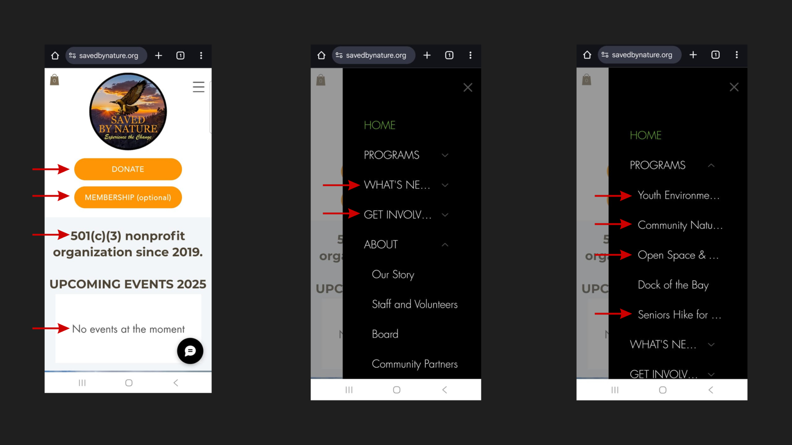
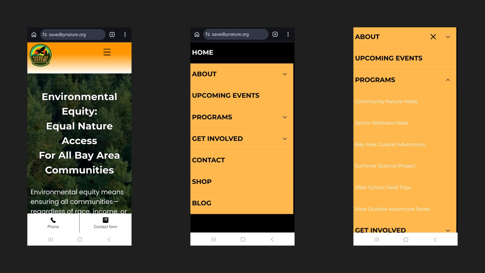
1. Truncated Mobile Navigation

The mobile hamburger menu cut off menu item labels mid-word:

  • “WHAT’S NE…” instead of WHAT’S NEW
  • “GET INVOLV…” instead of GET INVOLVED
  • All program names in the PROGRAMS submenu were cut off before they could be read


Visitors couldn’t identify key pages at a glance. They were guessing at destinations rather than navigating with confidence.

2. Buried Program Information

Program pages were accessible only three to four clicks deep on mobile. A parent or community member arriving on the homepage with no prior knowledge of SBN’s site structure had no logical shortcut to program information. On a site where program enrollment was the primary conversion goal, every unnecessary click was a potential exit.

3. Non-Responsive Content

Site content had not been built or tested for mobile display:

  • Elements were misaligned at smaller screen sizes
  • Text was difficult to read on mobile
  • Interactive elements were not optimised for touch
Saved By Nature mobile navigation before rebuild, June 2025: annotated three-panel composite showing hamburger menu icon on homepage, expanded black overlay navigation with top-level items truncated as "WHAT'S NE..." and "GET INVOLV...", and Programs submenu expanded showing all five program names cut off mid-word
Before: the mobile navigation as it existed in June 2025. Top-level labels truncated, program names illegible.

The Rebuild

Approach

The decision was made to rebuild the entire site from the ground up rather than patch individual issues. A surface-level fix would have left the underlying structural problems intact — and any content or SEO work built on top of a broken foundation would be undermined by it.

The rebuild was guided by four objectives:

  1. Improved UX — reduce friction at every stage of the visitor journey.
  2. SEO foundations — build a crawlable, well-structured site from the start.
  3. Conversion optimisation — make it easy for visitors to take action.
  4. Visual consistency — establish a brand identity that holds across every page.

Brand & Visual Identity

A consistent color palette was established and applied across the rebuilt website and all marketing materials — replacing the inconsistent visual presentation the original site had carried.

ColorHex CodeUsage
Deep Orange#FF9500CTA buttons
Light Orange#FFB84DApplied throughout as needed
White#FFFFFFApplied throughout as needed
Black#000000Applied throughout as needed
Saved By Nature brand colour palette showing four swatches: FF9500 (deep orange), FFB84D (light orange), FFFFFF (white), and 000000 (black), implemented consistently across the rebuilt website and all marketing materials
The brand colour palette established during the rebuild, applied consistently across all pages and marketing materials.

UX Enhancements

Two navigation improvements were added to every main page of the rebuilt site.

Back-to-Top Button

A persistent Back-to-Top button was added throughout the site. On longer pages — such as program pages, and blog posts — this eliminates the need to scroll back to the top to reach the navigation. A small detail that meaningfully reduces effort on pages where users are actively reading.

Saved By Nature rebuilt homepage after November 2025 rebuild showing the new top navigation bar with eight fully labelled menu items — HOME, ABOUT, UPCOMING EVENTS, PROGRAMS, GET INVOLVED, CONTACT, SHOP, BLOG — above a full-width hero section with a forest aerial photo, the headline "Environmental Equity: Equal Nature Access For All Bay Area Communities", a paragraph introducing SBN's environmental justice mission, and a prominent "LEARN ABOUT ENVIRONMENTAL EQUITY" CTA button. The Back-to-Top button is visible in the lower right corner.
The rebuilt homepage. Eight fully labelled navigation items in the top bar; Back-to-Top button visible in the center right.

Tables of Contents with Jump Links

Every main page now includes a Table of Contents with anchor links to each section. This serves two purposes simultaneously:

  • For visitors: navigate directly to the information they need without scrolling through the full page
  • For SEO: provides crawlable internal link structure within each page


The homepage Table of Contents links to eight sections:

  1. Understanding Environmental Equity
  2. FAQ
  3. Bay Area Environmental Justice Movement
  4. Environmental Equity Impact & Results
  5. Saved By Nature Community Results
  6. Our Environmental Justice Programs
  7. Upcoming Events & Experiences
  8. Get Involved & Take Action
Saved By Nature rebuilt homepage Table of Contents section displayed on an orange background, listing eight jump-link sections: Understanding Environmental Equity, FAQ, Bay Area Environmental Justice Movement, Environmental Equity Impact & Results, Saved By Nature Community Results, Our Environmental Justice Programs, Upcoming Events & Experiences, and Get Involved & Take Action
The homepage Table of Contents — one of several applied across every main page of the rebuilt site.

Mobile Optimization

With the audit findings documented, the mobile experience was rebuilt end to end across three areas.

Navigation

BeforeAfter
Labels truncated mid-wordEvery label fully visible
Programs buried in multi-step pathPrograms accessible directly via PROGRAMS submenu
Menu structure unclearLogical, intuitive hierarchy throughout

Information Architecture

The IA was restructured so that key pages — particularly program information — are accessible in significantly fewer clicks. All six programs now appear as clearly labelled submenu items directly under PROGRAMS in the mobile menu:

  • Community Nature Hikes
  • Senior Wellness Hikes
  • Bay Area Coastal Adventures
  • Summer Science Project
  • After School Field Trips
  • Alive Outside Adventure Series

Responsiveness

All pages were built and tested across screen sizes:

  • Content layout adapts correctly to mobile screens.
  • Typography is legible at smaller sizes.
  • Images scale without cropping or overflow.
  • Interactive elements (buttons, forms, menus) work correctly on touch.
Saved By Nature rebuilt mobile navigation after November 2025 rebuild: three-panel composite showing the new homepage hero with "Environmental Equity: Equal Nature Access For All Bay Area Communities" headline and Phone and Contact form sticky footer buttons, the expanded mobile menu with fully visible labels — HOME, ABOUT, UPCOMING EVENTS, PROGRAMS, GET INVOLVED, CONTACT, SHOP, BLOG — and the PROGRAMS submenu expanded showing all six program names fully legible: Community Nature Hikes, Senior Wellness Hikes, Bay Area Coastal Adventures, Summer Science Project, After School Field Trips, and Alive Outside Adventure Series
After: the rebuilt mobile navigation, November 2025. All labels visible; all six programs legible in the submenu.