The Programs section had two compounding failures: a near-complete absence of program content, and no infrastructure for the one action these pages exist to enable — enrollment. A visitor would arrive at any of seven program pages, find a schedule and little else, and then have nowhere to go. No enrollment form, no registration link, no contact pathway, and no indication of how to actually join.
This was both a content problem and a conversion infrastructure problem — and it affected every program page without exception.
Overview
Adequate
Photography & visual design (desktop)
Overview card photography strong; schedule pages contain none
Poor
Photography & visual design (mobile)
Critical Gap
Program content quality
Partial
Accessibility documentation
Critical Gap
Enrollment infrastructure
Critical Gap
Professional referral pathways
Poor
Mobile experience
Poor
Technical stability
Table of Contents
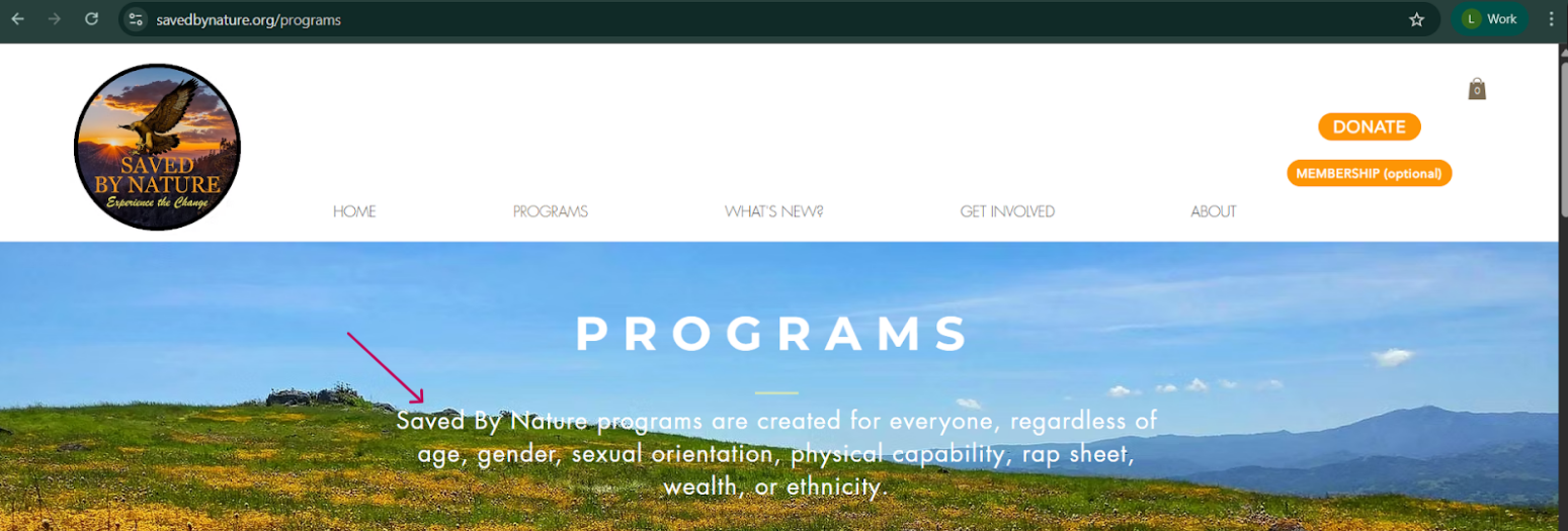
The Programs page opens with a full-width hero image and an inclusivity statement notable for its specificity — explicitly naming populations standard nonprofit language often omits: people with criminal records, people facing economic barriers, and LGBTQ+ individuals.
The statement communicates values effectively and sets a clear expectation for visitors who may have been excluded from traditional outdoor experiences. It is not followed by any pathway to act on that interest.
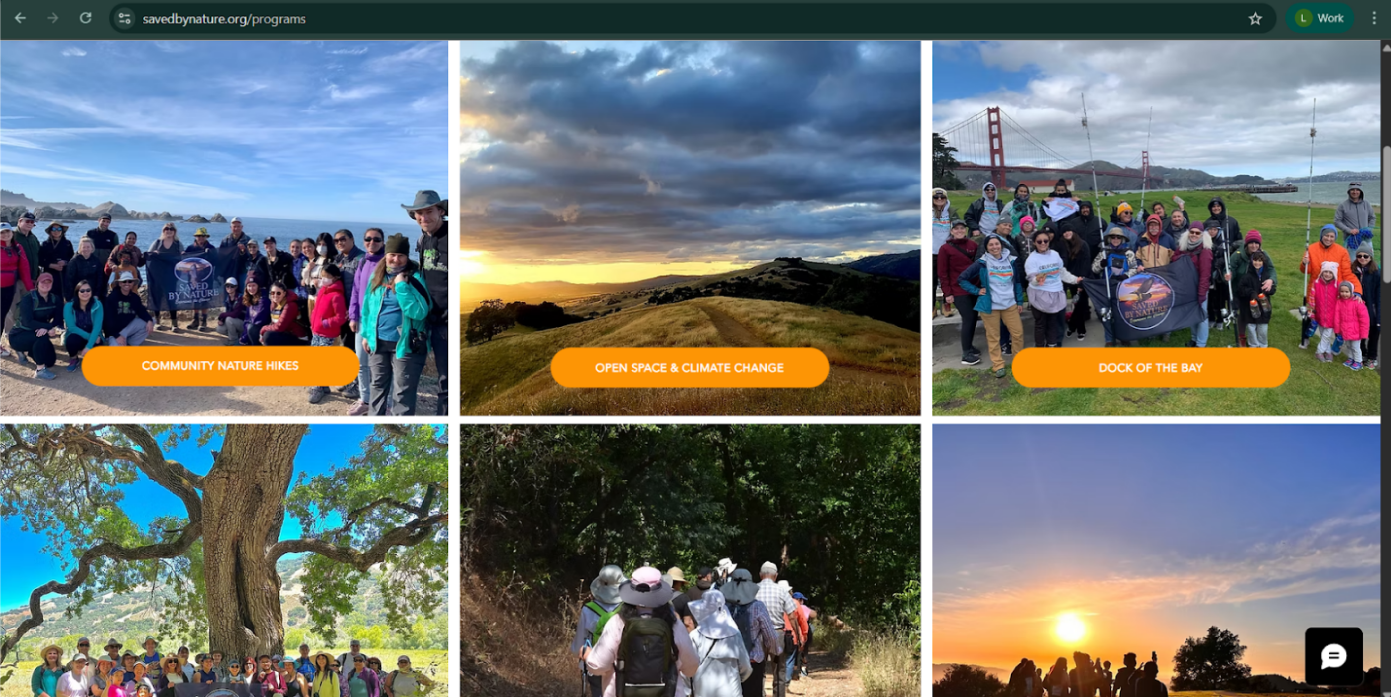
Below the hero, a six-card grid presents high-quality photography with authentic diversity across age, ethnicity, and ability. Recognizable Bay Area landmarks establish immediate geographic relevance. Each card has one orange button leading to a schedule page — the primary and only navigation element on the page.
The card grid functions as the entire program discovery layer for the section. There is no program description, no explanation of who each program is for, no sense of what participation involves, and no pathway to join.
Every individual program page follows the same structure: a schedule — and in most cases, little else — followed by no enrollment pathway.
| Program | Content | Enrollment Infrastructure |
|---|---|---|
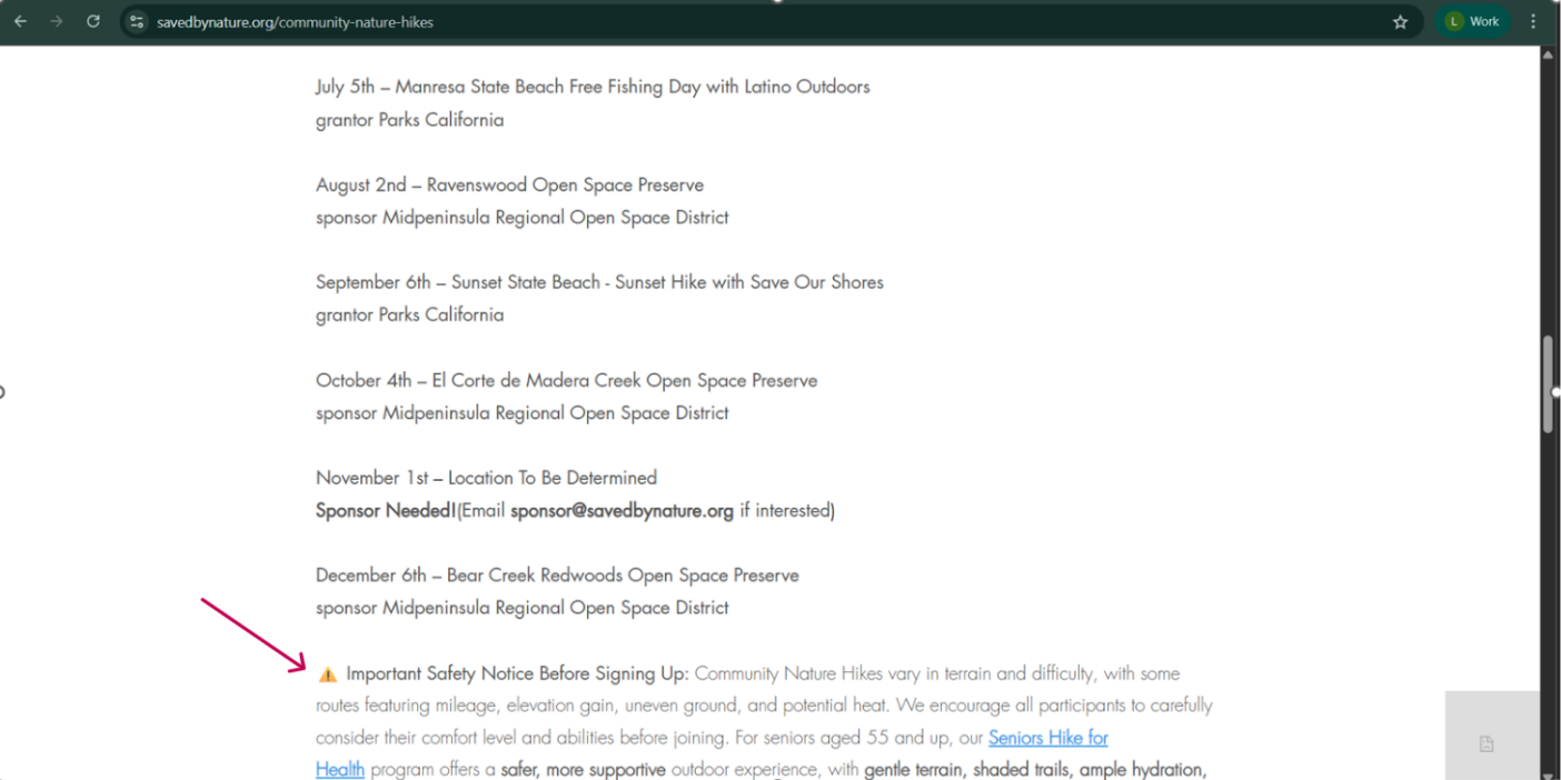
| Community Nature Hikes | Schedule + sponsor email only | None |
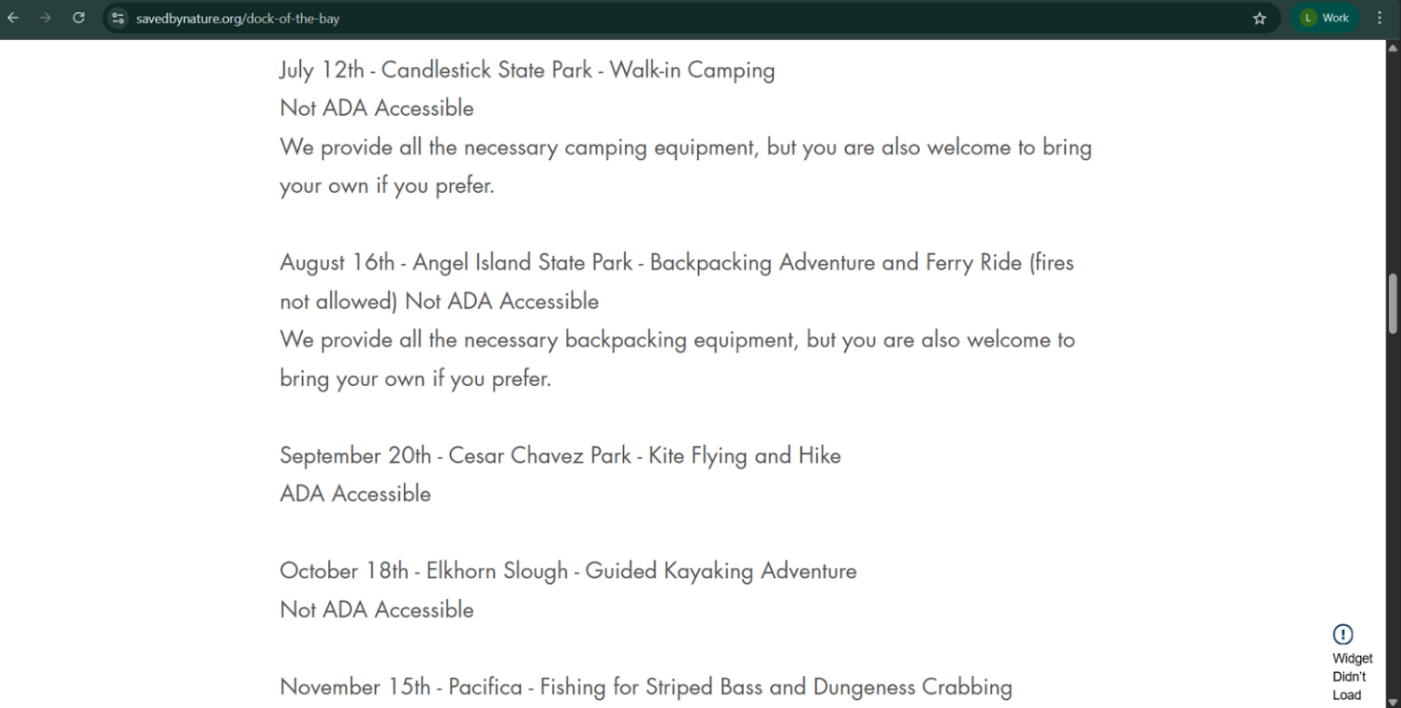
| Dock of the Bay | Schedule with per-event ADA notation and equipment notes | None |
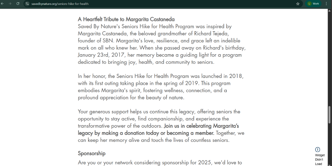
| Seniors Hike for Health | Founding tribute + donation ask + sponsor email | Sponsorship email only |
| Open Space & Climate Change | Partial schedule | None |
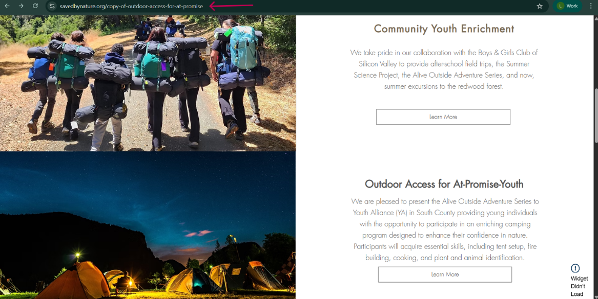
| Youth Environmental & Social Justice | Partner org names + "Learn More" buttons | Partner referral only |
| Headwaters to the Bay | Partial schedule | None |
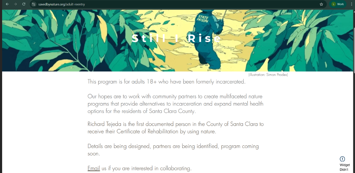
| Adult Reentry | Placeholder — "coming soon" | None |
Entries across July–November 2025 with date, location, activity type, ADA accessibility status, and equipment notes — the most specific information on any program page in the section. Activity variety (camping, backpacking, ferry travel, kayaking, kite flying, fishing) suggests an active, multi-discipline program, but none of that context is communicated on the page.
Leads with “A Heartfelt Tribute to Margarita Castaneda” — grandmother of founder Richard Tejeda — connecting her passing to the program’s 2018 founding. The tribute closes with a bolded CTA to donate or become a member. No program description appears before or after it. A healthcare provider considering a patient referral would find a founding story and a donation ask with nothing in between.
Live on an exposed staging URL — /copy-of-outdoor-access-for-at-promise — signaling to any visitor or search engine that the page was never properly finalized. Two program tracks are described in partnership with the Boys & Girls Club of Silicon Valley and Youth Alliance, each with a “Learn More” button, but neither provides a direct enrollment pathway for families or a referral mechanism for the probation officers, social workers, and school counselors most likely to connect this population with the program.
The most incomplete page in the section. The “Still I Rise” hero illustration is visually striking and tonally appropriate — but the content beneath it is a placeholder. The page identifies Richard Tejeda as the first documented person in Santa Clara County to receive a Certificate of Rehabilitation by using nature — a significant claim presented as a single line of small body text rather than a headline driving professional referrals. The page closes with “collaborating” framed as a partner-acquisition ask, not a pathway for the formerly incarcerated adults the program is for.
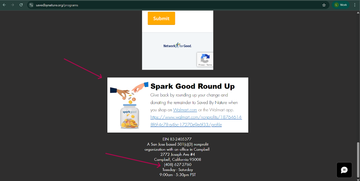
Below the newsletter form, a Spark Good Round Up widget adds a third financial touchpoint — after DONATE in the header and the newsletter form — inviting visitors to round up Walmart purchases in support of SBN.
The footer contains the only contact information present anywhere on the site: a physical address, a phone number, and business hours — presented as organizational credentials, not a participant contact pathway.
Several SBN programs are explicitly designed to be accessed through professional referrals. The site provided nothing for those referrers.
Seniors Hike for Health
Healthcare providers
❌ No referral form, no professional contact
Adult Reentry
Probation officers, case managers
❌ “Coming soon” — no timeline, no contact
Youth Environmental & Social Justice
Schools, social workers, probation officers
❌ No mechanism for the referring professional
These are not hypothetical visitors. They are the referral pathways that would drive the highest-quality, most mission-aligned enrollment for SBN’s programs — and the site provided them nothing.
The Programs section had two compounding problems: shallow or absent program content across most pages, and no enrollment infrastructure to convert visitors into participants even on the pages where schedules existed. The result was a section that listed programs but provided neither the information nor the pathways needed for community members to join them. Before any conversion infrastructure could be built, the content itself needed to be created.
| Dimension | Assessment |
|---|---|
| Photography & Visual Design (desktop) | 🟡 Adequate — overview photography strong, schedule pages have none |
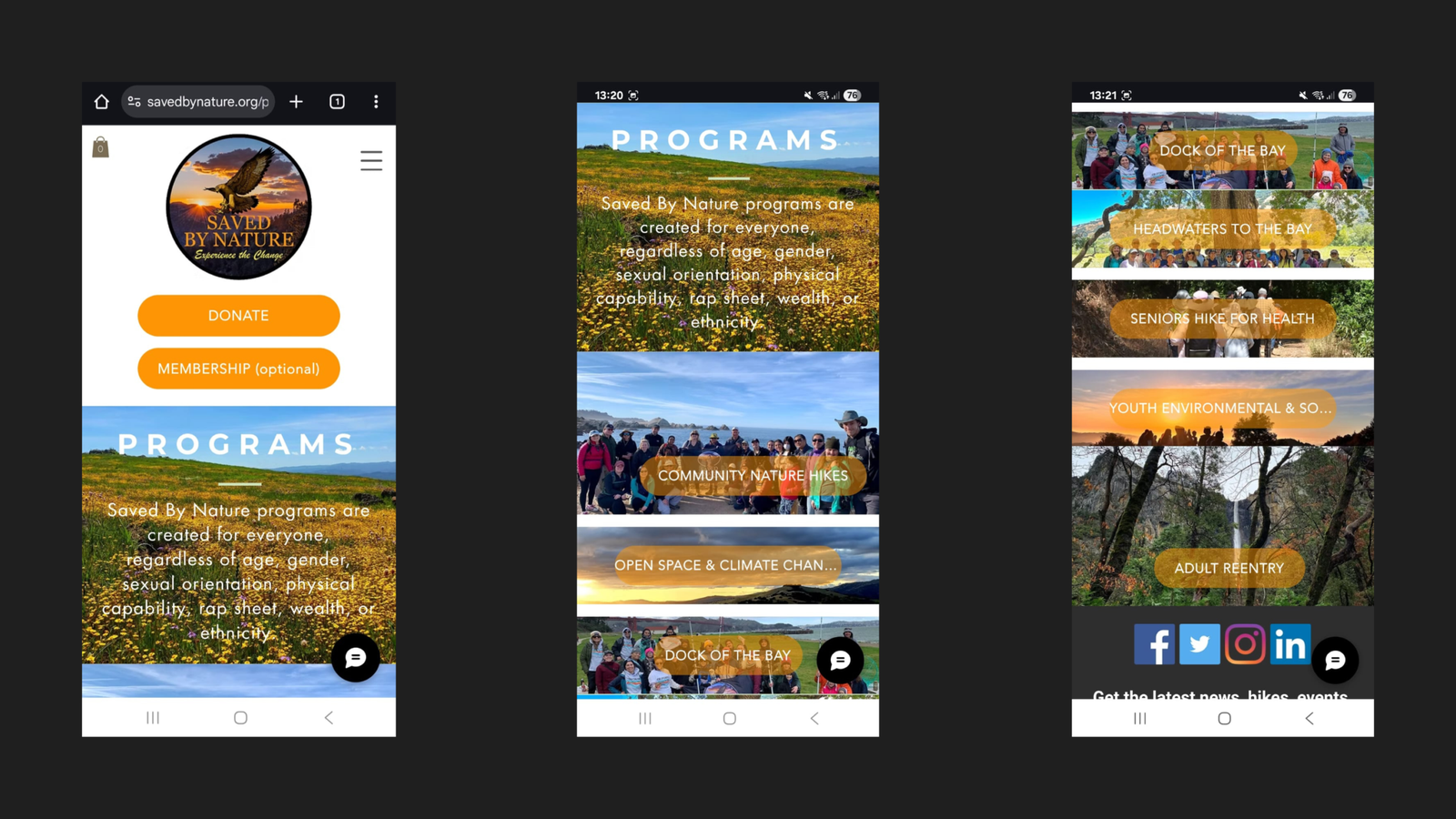
| Photography & Visual Design (mobile) | 🔴 Poor — inconsistent layout, buttons obscure photos |
| Program Content Quality | 🔴 Critical gap — descriptions absent across all 7 programs |
| Accessibility Documentation | 🟡 Present on one program only |
| Enrollment Infrastructure | 🔴 Critical gap — zero pathways across all 7 programs |
| Professional Referral Pathways | 🔴 Critical gap — no healthcare, justice, or social service mechanisms |
| Mobile Experience | 🔴 Poor — financial CTAs first, layout inconsistent, names truncated |
| Technical Stability | 🔴 Poor — widget errors; one page on an exposed staging URL |
This audit reflects the observed state of savedbynature.org/programs and all individual program pages as of July 2025. All findings are grounded in visual and structural review of the website at the time and are documented in page screenshots.
See how it was rebuilt
Full breakdown of the new program pages and the conversion pathways built to replace zero enrollment infrastructure.